
02.10.2025|
In the minds of designers
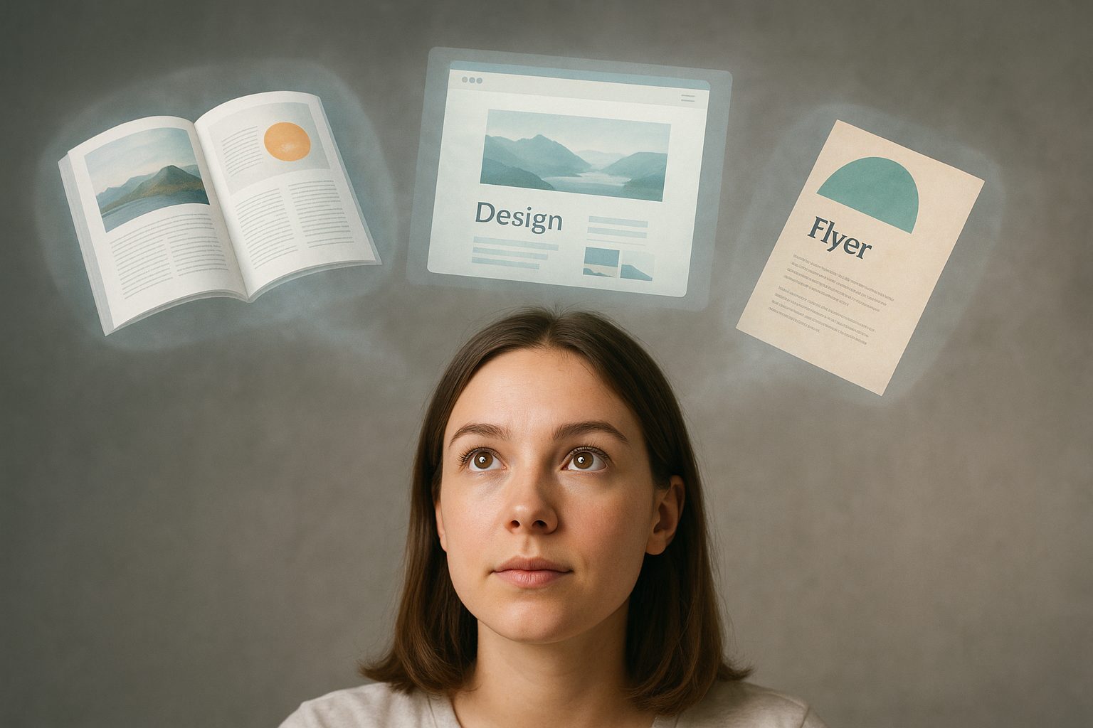
We know from our own experience how different inputs are combined to create a text. But how do designers go about it? What do they need from us writers so that they can create a layout? That was the question I asked two colleagues who collaborate regularly with open up.
As an editor, I’m fascinated by what designers do with text modules. We often only send Word documents – maybe with some creative ideas or advice depending on the topic and client – and then let ourselves be surprised by how our colleagues have implemented them.
open up doesn’t have its own graphics department and collaborates on content projects with other agencies and freelancers from our network. These include traditional print publications like magazines and anniversary publications as well as content for websites, newsletters and social media.
In this article, I would like to explore what happens on “the other side” once the inputs are available. Which thought processes do graphic artists use? Which challenges do they face when working with us writers? And can we support them in the best possible way?
The answers were provided by:
What do you do if you have texts for a magazine, for example, and have to create a layout?
Rachel: If it’s an existing magazine that already has a visual concept and layout system, I receive the page layout in advance. That gives me an overview of the magazine’s planned structure and shows me how much space is envisioned for which content. I follow existing design guidelines governing things like typography, colours, title hierarchies, graphic elements and imagery. First of all, I define where text and images are located and how the space is structured on the spread. What’s important to me is that the text and images work together in a creative overall plan – I always view the two-page spread as a single unit. Each spread/page comes with new artistic decisions. Pages that are allowed to deliberately break the grid without looking out of place are particularly challenging.
Nico: First, I read and structure the text. Which text modules are there? Titles, leads, quotes, boxes, main statements / secondary statements. Which content can be visualised through the use of photography or illustrations? Where can I place the focus? Then I incorporate the entire text into a very rough layout with the specified number of pages. That gives me a sense of how much artistic freedom I have at my disposal. Initial assessments like this help me to develop visual ideas early on in the process and then design specific layouts.
Angélique: I read the text once and see if I have any special ideas about the main message or individual aspects of the text. This usually brings images to my mind’s eye. If I notice that I’m digressing, I re-read the text. If any of the terms are unclear, I try to understand them. And I always look for unusual but understandable equations to visually illustrate a potentially complex topic.
When designing the layout, which three elements are particularly important to you and why?
Rachel: Typography (transports messages and creates an identity), white space (as an intentional creative tool, it establishes calm, organisation and flow), image composition (image selection and placement lend excitement and atmosphere to the layout).
“Neither side should be too insistent on using their own creations and instead seek a consensus.”
Angélique El Morabit, angeliqueelmorabit.com (Freelancerin/selbständig)
Nico: Typography (bringing the design to life, and this is an honest-to-goodness design element), vibrancy (I like vibrant, dynamic designs – this can manifest itself in very different ways), decisions (conscious decision-making during the layout process is important to me).
Angélique: The triad of design, clean typography and reader guidance / readability is most important to me. And last but not least: surprising (artistic) elements.
Which challenges do you face when working with editors?
Rachel: More text than space, lack of white space tolerance, late text deliveries or frequent changes (even small changes to the text can result in time-consuming layout adjustments), ignorance of design systems, unclear briefings with vague instructions or incomplete content.
Nico: From a designer’s point of view, I think incorporating too much content is challenging. It limits my creativity (or at least that’s how it feels). Last-minute changes to the text can force us to toss out previously taken design decisions because they can result in layout changes.
“Breaking a rule can make sense in certain contexts.”
Rachel Pfaffen, metaloop
Angélique: I’d say that the better (trained?) the editor is, the fewer challenges you have to overcome as a designer. 🙂 Or the better the chemistry between the two, the faster and better you can achieve results. Every person has to have an understanding of the work done by the other person. A joint briefing/agreement is also fundamental. Once you’ve agreed on the essence of the message, you should be able to achieve good results as a team. Neither side should be too insistent on using their own creations and instead seek a consensus: That means the editor should be able to cut 50 characters if the text permits. For designers, on the other hand, the following applies: Kill your darlings – sometimes our designs get on the wrong track, and we have to admit that nobody but us understands the idea 🙂
What do you need from us so you can do your job as expediently as possible?
Rachel: A clear, complete briefing, timely and structured delivery of all texts, images, image rights, etc. and clear content management. Plus creative freedom (no micromanaging, rather trust in our visual skills) and a final version of the text before the layout work starts.
Nico: Early integration into the concept: What is the objective of the text and the final layout? Besides that, clearly structured texts that are as final as possible.
Angélique: A good introduction to the topic and the key message. As well as information about an approximate cost/budget and a time frame.
“I’m not a fan of pure decoration and over-the-top presentation.”
Nico Kühne, SOURCE
What are no-goes when it comes to layout work?
Rachel: Poor image quality, too many different fonts (resulting in visual chaos and a restless feel), a lack of visual structure and guidance, outdated clipart or abrupt changes in style (which look cheap and thoughtless). Exceptions confirm the rule: In certain contexts – like a punk-fanzine or a deliberately disruptive layout – breaking the rules can make sense. But that requires artistic finesse and a clear concept.
Nico: I’m not a fan of pure decoration and over-the-top presentation. I like it when you can look at a design and read out a clear creative idea, an opinion and a certain amount of sophistication.
Angélique: Design for design’s sake (a design that fails to adequately convey the content, also known as decorative design), an imbalance between content and white space, inferior or generic images that don’t make a statement, mixed styles and sloppy typography.
Photo credits: Cover picture unsplash / Nick Fewings; portraits zVg

About the author
If she had the necessary talent, Michelle Russi would consider a second apprenticeship as a designer. She prefers to leave that kind of work to the professionals, however.